CSS 学习
CSS 构造块
- 构造样式规则
selector {
property:value value value;
property:value value value;
} - 继承
- 强制继承 inherit
- 可继承属性
- 文本
- color a元素除外
- direction 方向
- font 字体
- font-family 字体系列
- font-size 字体大小
- font-style 设置斜体
- font-variant 设置小型大写字母
- font-weight 设置粗体
- letter-spacing 字母间距
- line-height 行高
- text-alion 设置对齐方式
- text-indent 设置首行缩进
- text-transform 修改大小写
- visibility 可见性
- white-space 指定如何处理空格
- word-spacing 字间距
- 列表
- list-style 列表样式
- list-style-image 为列表指定定制的标记
- list-style-position 确定列表标记的位置
- list-style-type 设置列表的标记
- 表格
- border-collapse 控制表格相邻单元格的边框合并为单一边框
- border-spacing 指定表格边框之间的空隙大小
- caption-side 设置表格标题的位置
- empty-cells 设置显示表格中的空单元格)
- 页面设置
- orphans 设置当元素内部发生分页时在页面底部需要保留的最少行数
- widows 设置当元素内部发生分页时在页面顶部需要保留的最少行数
- page-break-inside 设置元素内部的分页方式
- 其他
- cursor 鼠标指针
- quotes 指定引号样式
- 文本
- 不可继承属性
- border
- padding
- width height
- 层叠
- 特殊性
- #id
- .class.otherclass
- class
- 元素名
- 顺序
晚出现的优先级高 - 重要性
!important
- 特殊性
- 媒体类型
@media print {
    selector{
        property:value;
    }
}
操作样式表
- 链接外部样式表
<link rel="stylesheet" href="url.css"/> - 嵌入样式表
<head> <link rel="stylesheet" href="url.css"> <style> selector { property: value; } </style> </head> - 内联样式
<元素名 style="property:value;property:value"/>
选择器
-
两个选择器间有空格表示上下文关系
- 元素的类型或名称
- 元素所在的上下文
- 后代结合符
ancestor 空格 descendant - 子结合符
parent > child - 相邻同胞结合符
sibling+element - 普通同胞结合符
sibling~element
- 后代结合符
- 元素的类或ID
- .class
- #id
- 元素的伪类或伪元素
- element:first-child 第一个子元素
- element:last-child 最后一个子元素
- element:first-letter 元素的第一个字母
- element:first-line 元素的第一行
- element
- :link 从未被激活或指向
- :visited 访问者已激活过
- :focus 通过键盘选择、处于活跃状态
- :hover 光标指向链接
- :active 激活时
- 元素是否有某些属性和值
- element[attribute]
匹配指定属性 - element[attribute="value"]
完全匹配指定属性值 - element[attribute~="value"]
属性值是以空格分隔的多个单词,其中有一个完全匹配指定值 - element[attribute|="value"]
属性值以value开头 - element[attribute^="value"]
属性值以value开头,value为完整的单词或单词的一部分 - element[attribute$="value"]
属性值以value结尾,value为完整的单词或单词的一部分 - element[attribute*="value"]
属性值为value子字符串
- element[attribute]
两个选择器间无空格表示并关系
两个选择器间有逗号表示选择器组
文本样式
- font:斜体 粗体 小型大写字母 字体大小/行高 字体系列
- font-family 字体
- font-style 斜体
- font-weight 粗体
- font-variant 小型大写字母
- font-size 字体大小
- line-height 行高
- text 文本
- word-spacing 字间距
- letter-spacing 字偶距
- text-indent 缩进
- text-align 对齐
- text-transform 文本大小写
- text-decoration 装饰线条
- white-space 空白属性
- background 背景
- background-color 背景颜色
- background-image 背景图像 url(image.url)
- background-repeat 重复背景图像的方向
- background-attachment 图像随页面滚动
- background-position 背景图像的位置
- background-size 背景图像的显示尺寸
- background-clip 背景显示的范围
- background-origin 背景开始的位置
- color 颜色
- colorname
- #rrggbb rgb(r,g,b) rgb(r%,g%,b%)
- hsl(h,s,l)
- rgba(r,g,b,a)
- hsla(h,s,l,a)
布局
- 兼容旧浏览器
- 重置浏览器默认样式
- display 元素的显示方式
- block 元素显示为块级元素
- inline 元素显示为行内元素
- inline-block 元素显示为行内元素,同时具有块级元素的特征
- list-item 列表
- none 隐藏元素,并将其从文档流中完全移除
- visibility 控制元素可见性
- 盒模型
- 默认
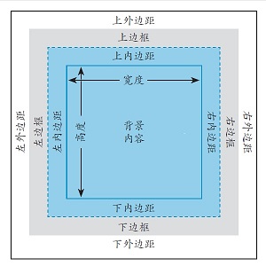
- box-sizing:border-box;
* { -webkit-box-sizing: border-box; -moz-box-sizing: border-box; box-sizing: border-box; } - width height
- min-width min-height max-width max-height
- padding 内边距
- padding:a; 应用于四个边
- padding:a b; 前值应用于上下边,后值应用于左右两边
- padding:a b c; 第一个值用于上边,第二个值用于左右边,第三个值用于下边
- padding:a b c d; 依次应用于上、右、下、左四个边
- border 边框
- border-style
- none,dotted点线,dashed虚线,solid实线,double双,groove槽线,ridge脊线,inset凹边,outset凸边
- border-width
- border-color
- border-image
- margin 外边距
- 默认
- float 浮动 下面的内容流动到周围
浮动元素溢出父元素:overflow:auto; - clear 清除浮动
.clearfix:before, .clearfix:after { content: " "; display: table; } .clearfix:after { clear: both; } .clearfix { *zoom: 1; } - position 元素定位
- 默认 position:static;
- 相对 元素从它的自然位置偏移
* { position:relative; top:a; right:b; bottom:c; left:d; } - 绝对 元素相对于其祖先元素(position:relative;)或body偏移
* { position:absolute; top:a; right:b; bottom:c; left:d; } - 固定在窗口 position:fixed;
- z-index:n;
元素在定位过的对象堆中的层级
不作用于position:static;
- overflow 元素溢出盒模型
- vertical-align 垂直对齐
- 数值偏移
- baseline 元素的基准线对齐父元素的基准线
- middle 元素位于父元素中央
- text-top 元素的顶部对齐父元素的顶部
- text-bottom 元素的底部对齐父元素的底部
- top 元素的顶部对齐当前行里最高元素的顶部
- bottom 元素的底部对齐当前行里最低元素的底部
- sub 元素成为父元素的下标
- super 元素成为父元素的上标
- cursor 鼠标指针
响应式页面
- 可伸缩的图像与多媒体 max-width: 100%;
- 弹性布局
- 媒体查询
- 媒体特性
- width height device-width device-height
- aspect-ratio高宽比 device-aspect-ratio
- orientation 方向
- color color-index monochrom单色
- resolution 分辨率
- scan 扫描
- grid 栅格
- -webkit-device-pixel-ratio WebKit设备像素比
- -moz-device-pixel-ratio Mozilla设备像素比
- 媒体查询语法
- 指向外部样式表的链接
media="logic type and (feature: value) and (feature: value)" - 位于样式表中
@media logic type and (feature:value) - logic:only或not
- type:screen,print
- feature:预定义的媒体特性
- 指向外部样式表的链接
- <meta name="viewport" content="width=device-width, initial-scale=1"/>
视觉区域的宽度会被设成与设备宽度相同的值
- 媒体特性